Notes on Latin American Graphic Design, Artes Gráficas, Typography, and Printed Matter from the ISLAA Library and Archives
On Now:
Jun 20, 202306.20.23
Re: Collection

Ulises Carrión, Untitled, date unknown. Stamping ink on paper, 13 ½ × 9 5/8 in. (34.3 × 24.5 cm). © and courtesy the Estate of Ulises Carrión

ENG
ESP
AUTHORS
Ramon Tejada

Re: Collection invites a range of historians, curators, and artists to respond to the artworks in our collection through approachable texts.

Ramon Tejada, 2022–23 Graphic Designer in Residence, muses on the multiplicity of perspectives on Latin American graphic design represented within the Institute for Studies on Latin American Art (ISLAA) Library and Archives, drawing upon printed matter and ephemera produced by artists and organizations, including Centro de Arte y Comunicación (CAYC), Galería Lirolay, and Ulises Carrión.

As a graphic designer, digging 1 through the ISLAA Library and Archives 2  was inspiring yet overwhelming, due to the sheer wealth of printed matter, graphic design works, and what I refer to as “artes graficás.” 3  What emerged was a picture of the beauty, breadth, and complexity of the Latin American art and design communities. As I reflected on my findings, a loose array of ideas, questions, and observations about works of graphic design began to take shape. These thoughts (words, sentences, strands of ideas, histories) have prompted me to reflect on what I thought I was going to find and what I actually found. The graphic designer in me was intentionally looking for works that spoke about community, colonization, revolution, and politics in the continent. I ultimately found that and much more. 

As I anticipated, I encountered a good deal of modernist-influenced graphic art in the archives. What I did not anticipate was the breadth of work that I would find, its many sources—cooperatives, communities, artists, designers, craftspeople—and the panorama of themes and narratives it addressed in relation to the daily lives of the peoples of Latin America. Each archival box presented a plurality of perspectives, beautiful possibilities, and gifts.

My archival adventure emphatically confirmed that graphic work from Latin America defies distillation into a single essence. The landscape of the Latin American context is vast, rich, and varied, spinning beautifully toward pluriversal 4 ways of being.

LAS NOTAS/NOTES

Cover of the publication Kokah de Lujo, by Eduardo Gudiño Kieffer and Edgardo Giménez (Buenos Aires: Editorial Barlovento, 1976). © the artist. Courtesy Edgardo Giménez and MCMC Galería

1. It is impossible to talk about Latin America (and its artistic and design production) without considering its history and the confluence of factors that played a vital role in the continent’s artistic development:

Colonialism → Politics → Power grabs → Religious interventions → Revolutions → Social and political uprisings → Migration and immigration → The disappearance, erasure and marginalization of the Indigenous and local histories → The conflict between la gente/el pueblo(the people) and the bourgeoisie

These are all key motivators and influences that are present in the efforts of many artists and designers whose works originate in the complex societies of Latin America.


2. The influence of European ideas, either through colonization or, later, through migration, has left an undeniable and indelible imprint on the work of artists and designers from Latin America.
GRAPHIC DESIGN

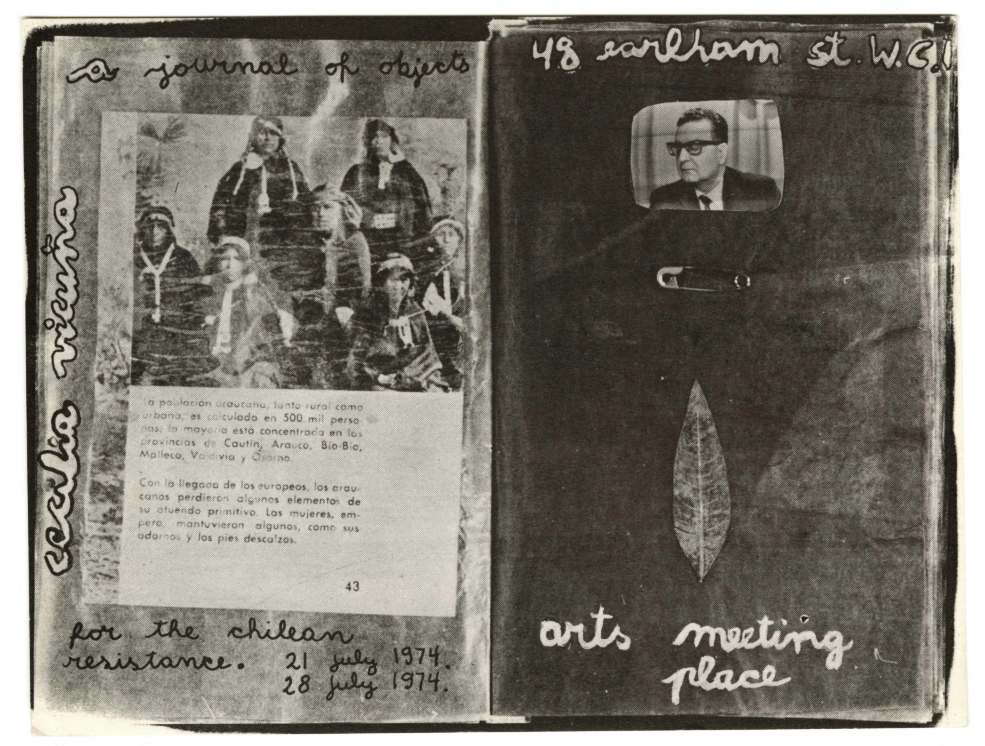
Invitation for A Journal of Objects for the Chilean Resistance, an exhibition of work by Cecilia Vicuña at Arts Meeting Place, London, July 21–28, 1974. © and courtesy the artist

3. Historically, the field of graphic design 5 has focused on and elevated the work and thinking of the Global North. Like much of art and design, the fields of graphic design and typography emerge from the European Renaissance and modernist movements in Europe (such as the Bauhaus and its progeny). These ideals and ways of seeing and making have been codified as accepted or “universal” norms.

4. Graphic design should be referred to as Western European graphic design.

5. Graphic design in the contemporary Latin American context has been deployed for commerce and capitalistic endeavors—“Buen diseño para la industria” (good design for industry)—such as branding for multinational corporations and state-owned entities). 6 

ARTES GRÁFICAS

Invitation for the exhibition Bertha Rappaport at the Galería del Centro Argentino por la Libertad de la Cultura, May 1965. Design by Edgardo Giménez. Courtesy Edgardo Giménez and MCMC Galería

6. Local culture, el pueblo, and la gente are expressed through artes gráficas (graphic arts). 

7. Artes gráficas move through communities; they are more inclusive, pluralistic, and localized; and they maintain a fluid way of being that mirrors the continent’s cultures, histories, and geographical landscapes. They consider the interdisciplinary movement of artists and communities through artistic mediums, ways of making, gestures, ideas, and perspectives.

8. In a local context, artes gráficas are deployed to create works that speak to the community in languages specific to those being addressed: Diseño que ayuda a facilitar la creación de una comunidad social y política, llena de ideas y felicidad, manifested through espacios públicos, acciones, acciones gráficas, y lo colectivo. In this approach, local production methods are used in collaboration with community members to make work that speaks directly to the community. The artists and designers who create artes gráficas experiment with the “standards” of graphic design in localized ways, using what has been left behind by colonialism writ large. 7 

9. Latin American artists and designers deploy artes gráficas to gather, join, develop, and support communities. In these communities, conversations and ideas about cultures and politics emerge from a multitude of perspectives.

10. These communities are making “designs [and art] that foster convivial reconstruction beyond the cultures of expertise and that promote a pluriverse of partially connected worlds in which all worlds strive for justice and craft autonomous relational ways of being while respecting the ability of other worlds to do the same.” 8 
TYPOGRAPHY

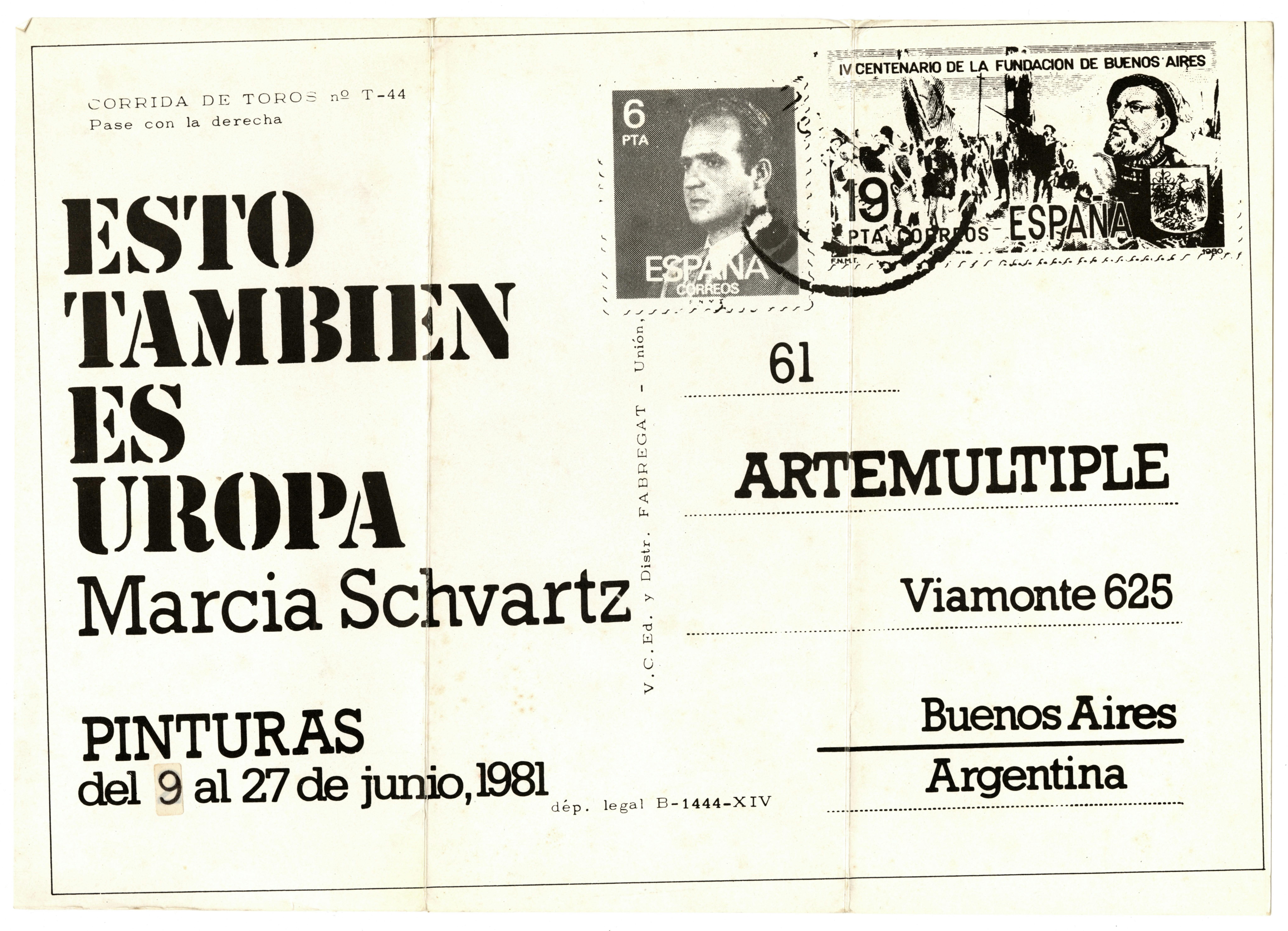
Invitation for the exhibition on Marcia Schvartz: Esto También es Uropa at Artemúltiple, Buenos Aires, June 2–27, 1981. © and courtesy the artist

11. When we speak of typography in the context of design, we are generally referring to a tradition that is primarily defined by the Latin alphabet.

12. In the words of designer and curator Ellen Lupton, “Typography is what language looks like.” For the purposes of this text, we are speaking primarily of giving the Spanish and Portuguese languages—holdovers of colonialism in the continent—a visual form. This linguistic homogeneity is in stark contrast to the lingual wealth that preceded colonization. Some studies estimate that more than two thousand languages were spoken throughout the Americas. 9  Despite the devastation caused by the European conquest, there are currently more than four hundred languages spoken in Latin America—some quite widely, such as Quechua and Guaraní, which are respectively used by ten million and six-and-a-half million people today.

13. Since the invention of the letterpress in 1455, printed matter—such as announcements, newspapers, and flyers—has become an important and accessible mode of communicating and sharing ideas. 10 

14. The first traditional printing press in the Americas appeared in Mexico City around 1539. 11  The history of printed matter and its use in disseminating ideas (artistic, social, and political) has deep roots in Latin America. An example is the work of the “Taller de Gráfica Popular,” founded in Mexico City in 1937. 12 The collective’s printed matter dealt with various subjects, including history and political and social themes.

15. Digging through the ISLAA Library and Archives, one encounters various iterations of modernism. The works in the reading room present extensive incorporation of the codified gestures of Western European graphic design and typography: the exacting use of grids and typographic conventions of the European Modernists (see the press announcements and catalogues from the Centro de Arte y Comunicación [CAYC]); a sharp focus on order, hierarchy, clarity, and reduction (especially apparent in the work created in the second half of the twentieth century); and the abandonment of maximalist and ornamental gestures in favor of functional, reductive ones. 

16. Of particular prevalence in this period is the use of sans serif typefaces, particularly the Swiss Helvetica, 13  which were readily accessible to printers and used extensively in work created for corporations, business, and industry. Helvetica and the associated design approach and philosophy became the “good” way to communicate visually worldwide: the universal style. This approach was believed to provide the work with authority and legitimacy. The visual language of forms created in Europe thus became cemented as the norm. 

17. These forms (graphic gestures such as Helvetica, which were associated with hierarchy and order) carry centuries of baggage. They are part of colonization’s legacy of brutalization of the land, the Indigenous peoples, and their ideas, customs, and language. These typographic artifacts have become a manifestation of centuries of atrocities and erasure.

18. Modernist typographic forms (Helvetica) and structures (grids and other comparable compositional approaches to “organizational clarity”) gave this printed matter authority and legitimacy while often bypassing established local vernaculars. 14 

19. Designer, researcher, and editor Silvia Fernández writes, “This modernity—or, better, ‘proto-modernity’—brought the period of ‘good taste and good speaking’ adopted from the Spanish colonizers to an end. Nevertheless, it was connected to Europe: travelers, immigrants, and exiles carried in their luggage testimonies of modernity in the form of books, magazines, works of art, and above all, ideas, which—along with the local ‘Criolla’ [lo cotidiano] culture—formed the new imaginary.” 15 

20. Of the printed matter that I encountered in the ISLAA Library and Archives, I gravitated particularly toward invitations and records of gatherings and meetings. These objects are examples of design and artes gráficas in the service of and as a conduit for community—they create spaces for engagement, gathering, and discussion. These “communities” included galleries and pop-ups that functioned outside of institutional spaces.

21. Printed matter and typography are conduits for building local communities.

22. Printed matter and Mail art are forms of decentered, communally created art and design. The networked and multireferential nature of these forms co-opt systems of power and put them to novel and anti-institutional use. Regarding Mail art’s relationship with state institutions such as the postal service, Mexican artist and publisher Ulises Carrión said that the art movement “knocks at the doors of the castle where the Big Monster lives.” 16 

SOME ADDITIONAL WORKS FROM THE ARCHIVES

Founded in Buenos Aires in 1968, CAYC was a multidisciplinary space that created a platform for the development of new and experimental art. The group’s visual identity aligned with the prevailing gestures of European modernist graphic design at the time, employing Helvetica in their logo and systematizing their printed matter (including invitations, press releases, and catalogues) through the use of a grid. It is not without irony that this controlled, hierarchical visual language was used to present the work of artists who critiqued colonial power in Latin America. 17 

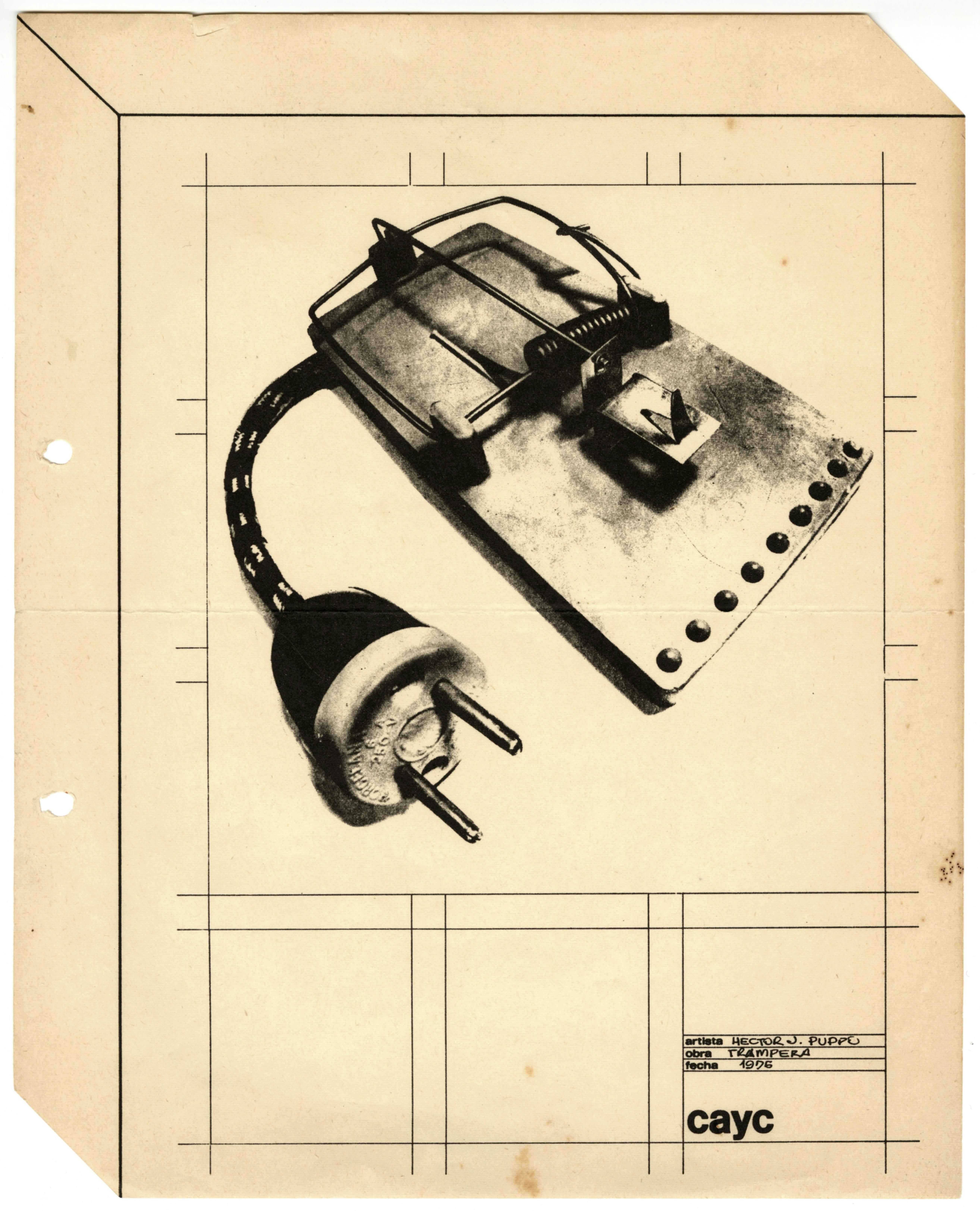
Printed on a piece of white paper is an image of a set mousetrap, from the back of which emerges a short electric cord with a two-prong plug. The bottom left and upper right corners of the paper are cut diagonally, and the page has been printed with black lines such that it appears to be a rectangular prism. On the bottom right corner of the page, a printed rectangle that has been filled out by hand reads: “Artista: Hector J. Puppo; Obra: Trampera; Fecha: 1976.” Below it is the logo of the CAYC.

Hector Puppo,Trampera, 1976. Mimeograph, 10 5/8 × 8 ½ in. (27 × 21.6 cm). © and courtesy the artist and Matías Glusberg

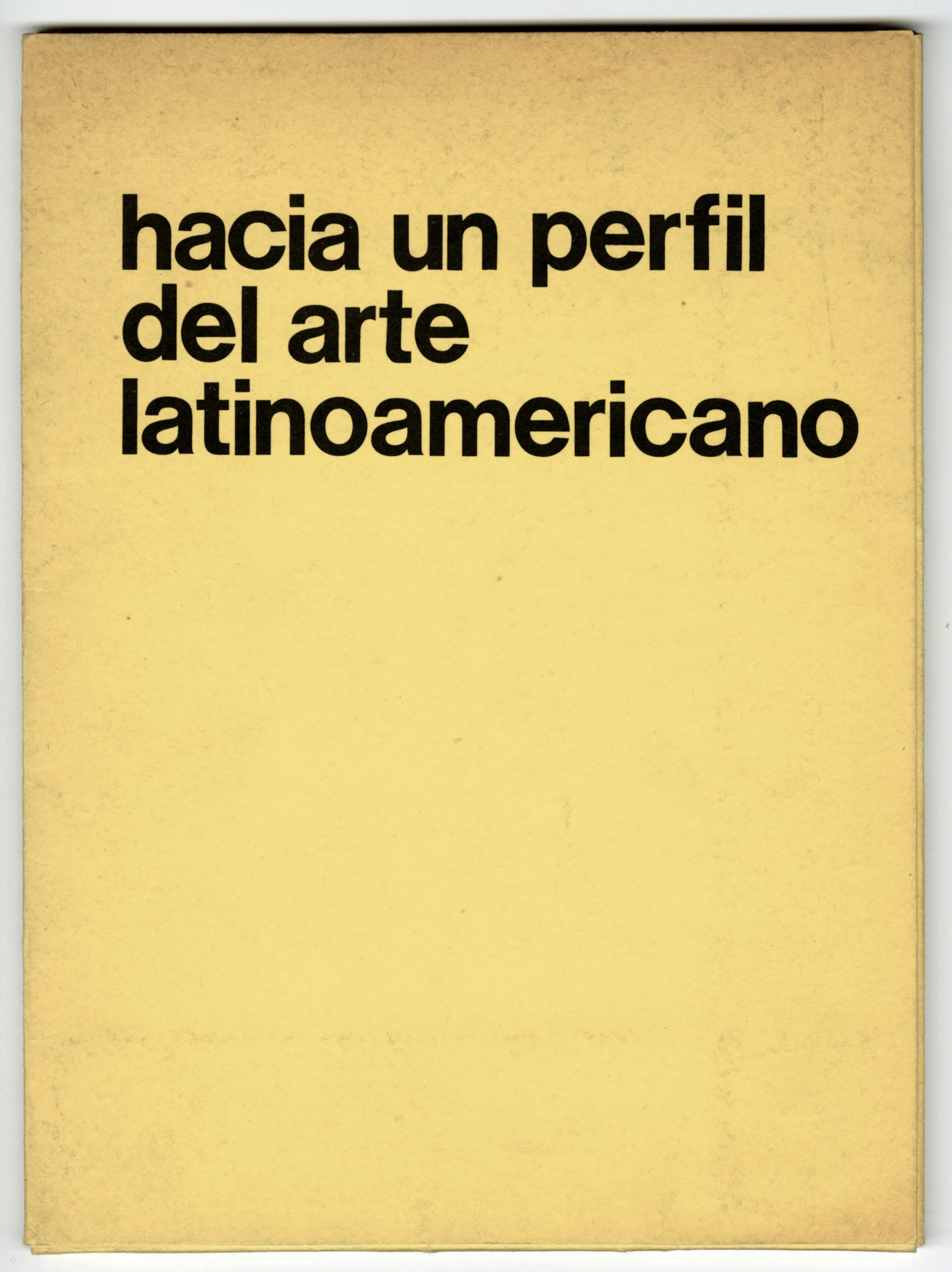
A book with a yellow jacket and black lettering with the book’s title.

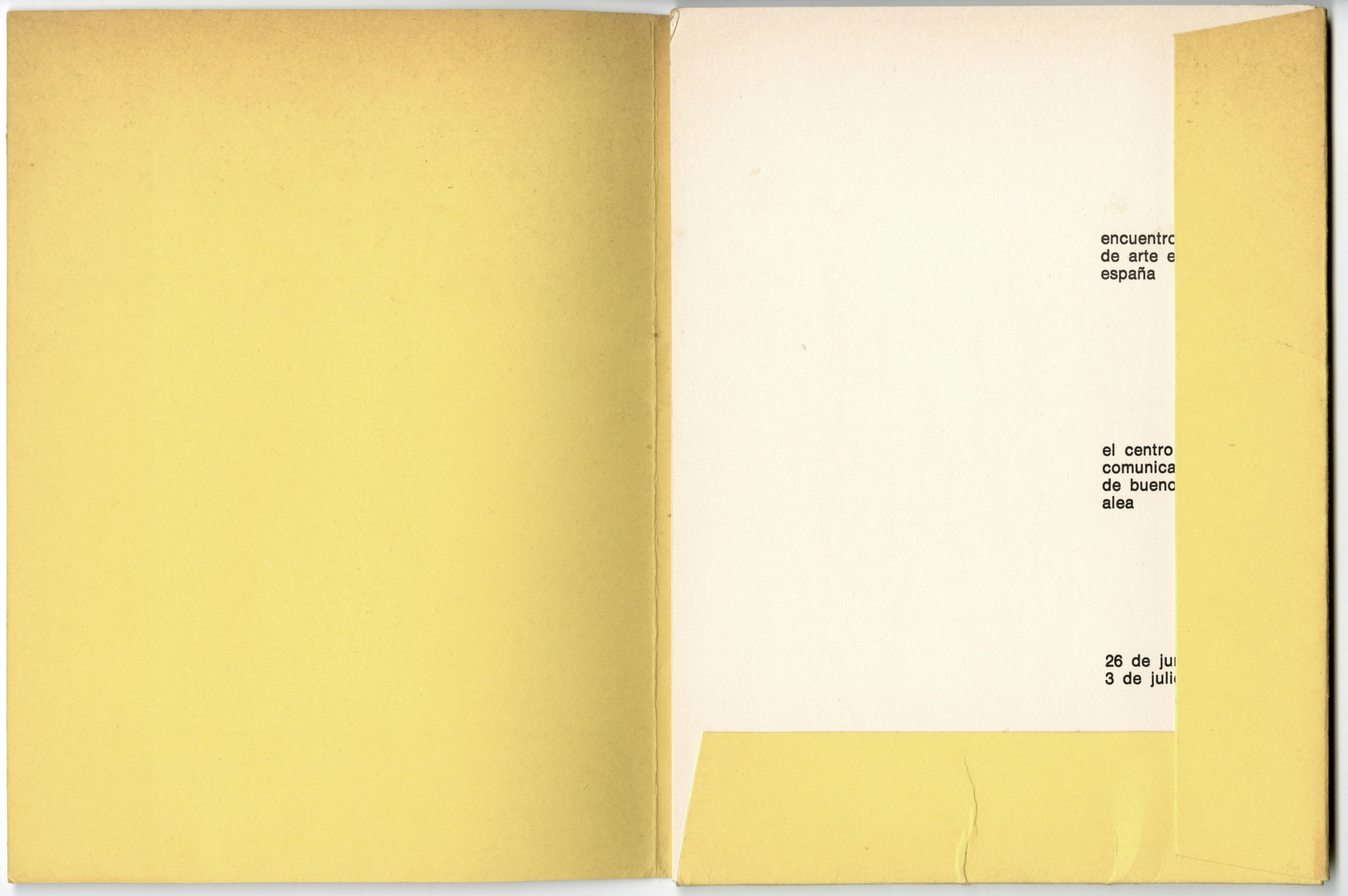
Cover of the exhibition catalogue Hacia un perfil del arte latinoamericano, edited by Jorge Glusberg (Buenos Aires: Centro de Arte y Comunicación, 1972). Glusberg also organized the exhibition of the same title for the Encuentro Internacional de Arte en Pamplona, España; Pamplona, Spain, June 26–July 3, 1972. © and courtesy Matías Glusberg

A book with a yellow jacket, opened such that the first page is visible beneath flaps on the right and lower edges of the book. Partially obscured by the jacket are the book’s title, publisher, and exhibition dates.

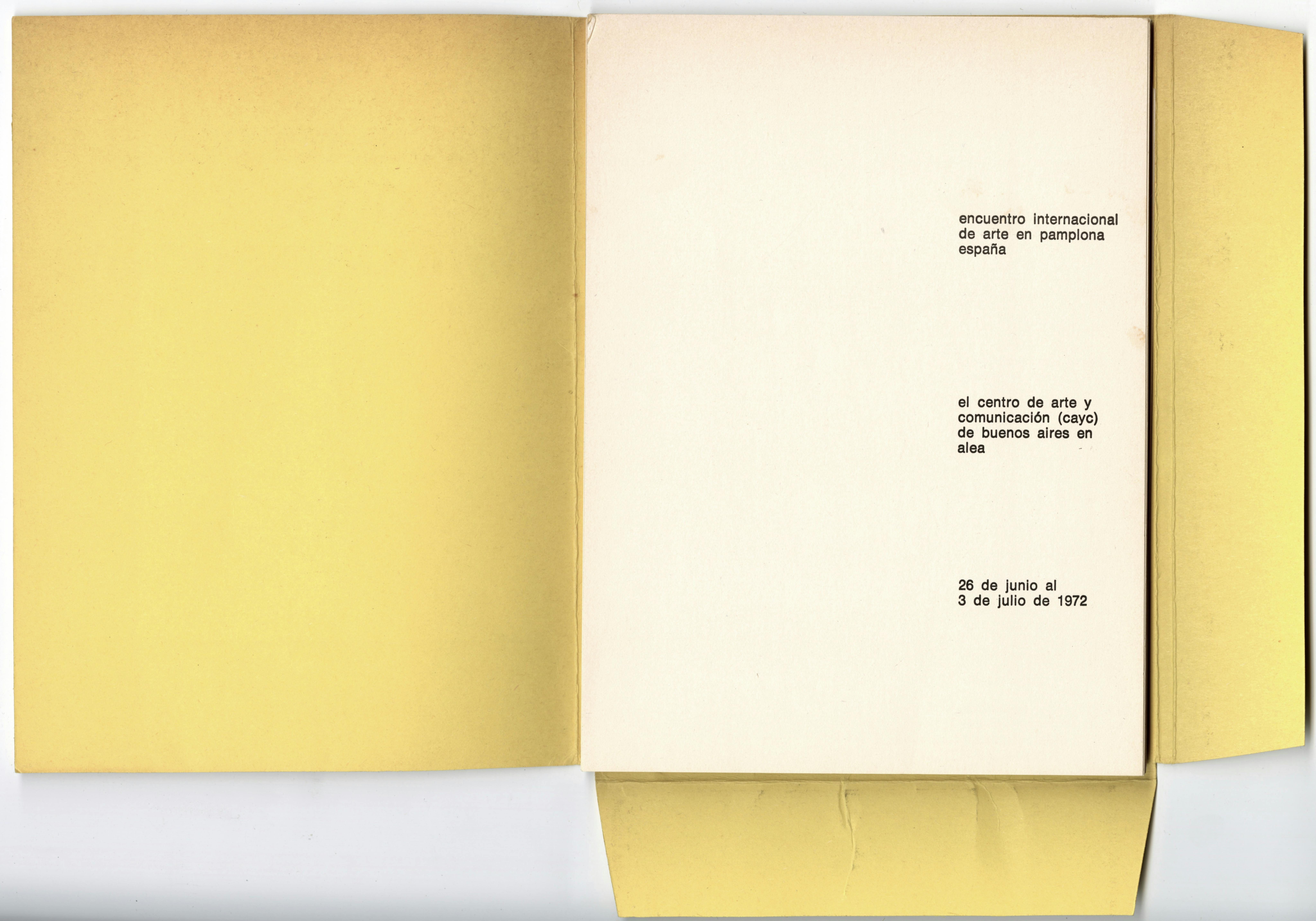
Spreads from the exhibition catalogue Hacia un perfil del arte latinoamericano. © and courtesy Matías Glusberg

A book with a yellow jacket with flaps on the right and lower edges of the book, opened to the first page. The title of the catalogue, the publisher, and the exhibition dates are printed in black type.

Spreads from the exhibition catalogue Hacia un perfil del arte latinoamericano. © and courtesy Matías Glusberg

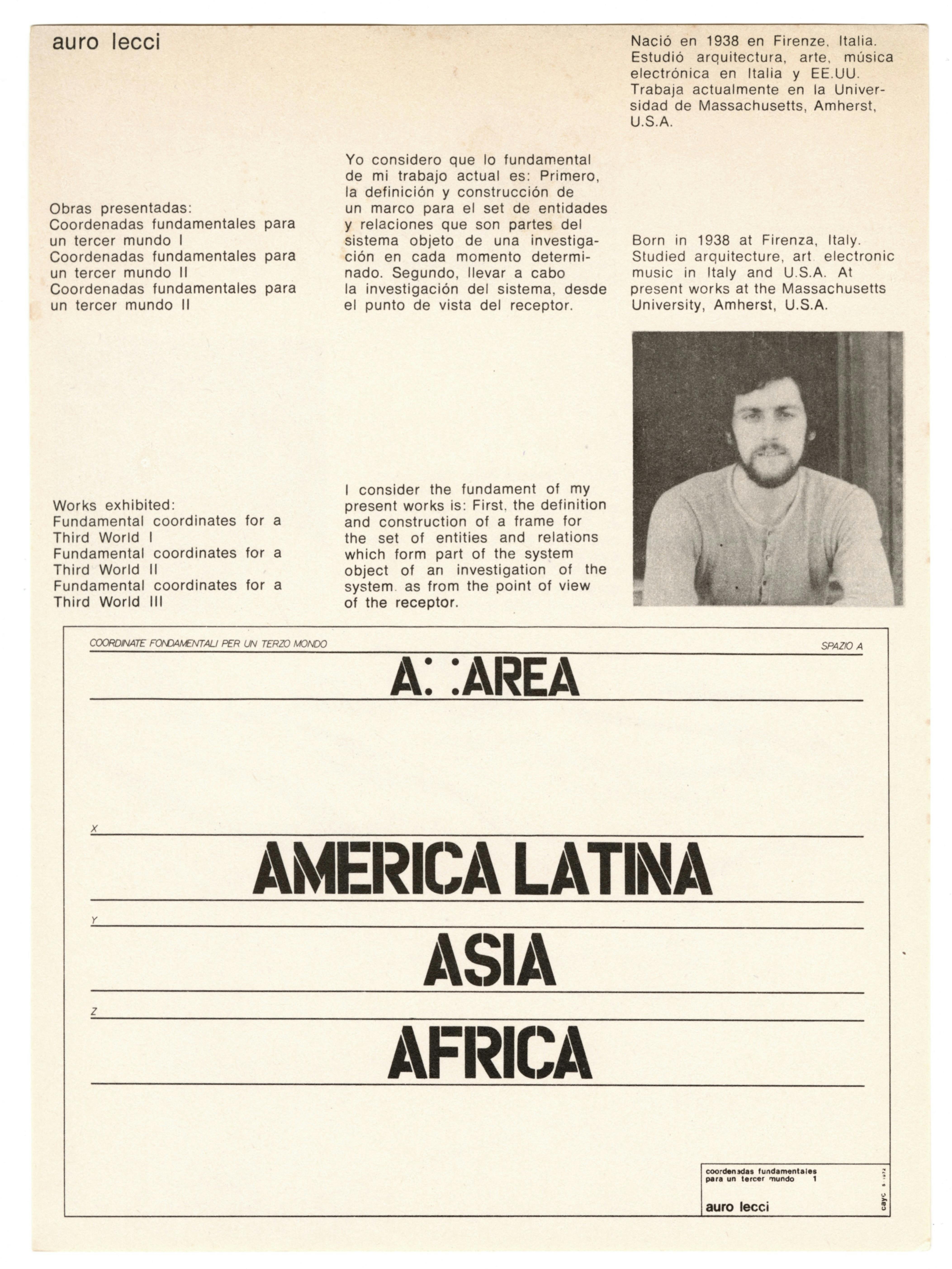
A sheet of white paper, printed with black text. On the top half of the page are printed the artist’s name, Auro Lecci; and, in both Spanish and English, a list of works; biography; artist statement; and portrait. The biography reads: “Born in 1938 at Firenza, Italy. Studied architecture, art, electronic music in Italy and U.S.A. At present works at the Massachusetts University, Amherst, USA.” The list of works reads: “Works exhibited: ‘Fundamental coordinates for a Third World I,' ‘Fundamental coordinates for a Third World II,’ and ‘Fundamental coordinates for a Third World II.’” The artist statement reads: “I consider the fundament of my present works is: First, the definition and construction of a frame for the set of entities and relations which form part of the system object of an investigation of the system as from the point of view of the receptor.” Within a black rectangular outline on the bottom half of the page, horizontal lines are interspersed. with a series of texts reading, from top to bottom, “Coordinate fondamentali per un terzo mondo,” “A” and “area” separated by four dots outlining a square, “America Latina,” “Asia,” and “Africa.” In a small box at the bottom right corner of the larger black rectangular outline, the artist’s name appears in small black letters.

Spreads from the exhibition catalogue Hacia un perfil del arte latinoamericano, edited by Jorge Glusberg (Buenos Aires: Centro de Arte y Comunicación, 1972), showing artwork by Auro Lecci along with an artist statement, portrait, and biographical information on the artist. Glusberg also organized the exhibition of the same title for the Encuentro Internacional de Arte en Pamplona, España; Pamplona, Spain, June 26–July 3, 1972. © and courtesy the artist and Matías Glusberg

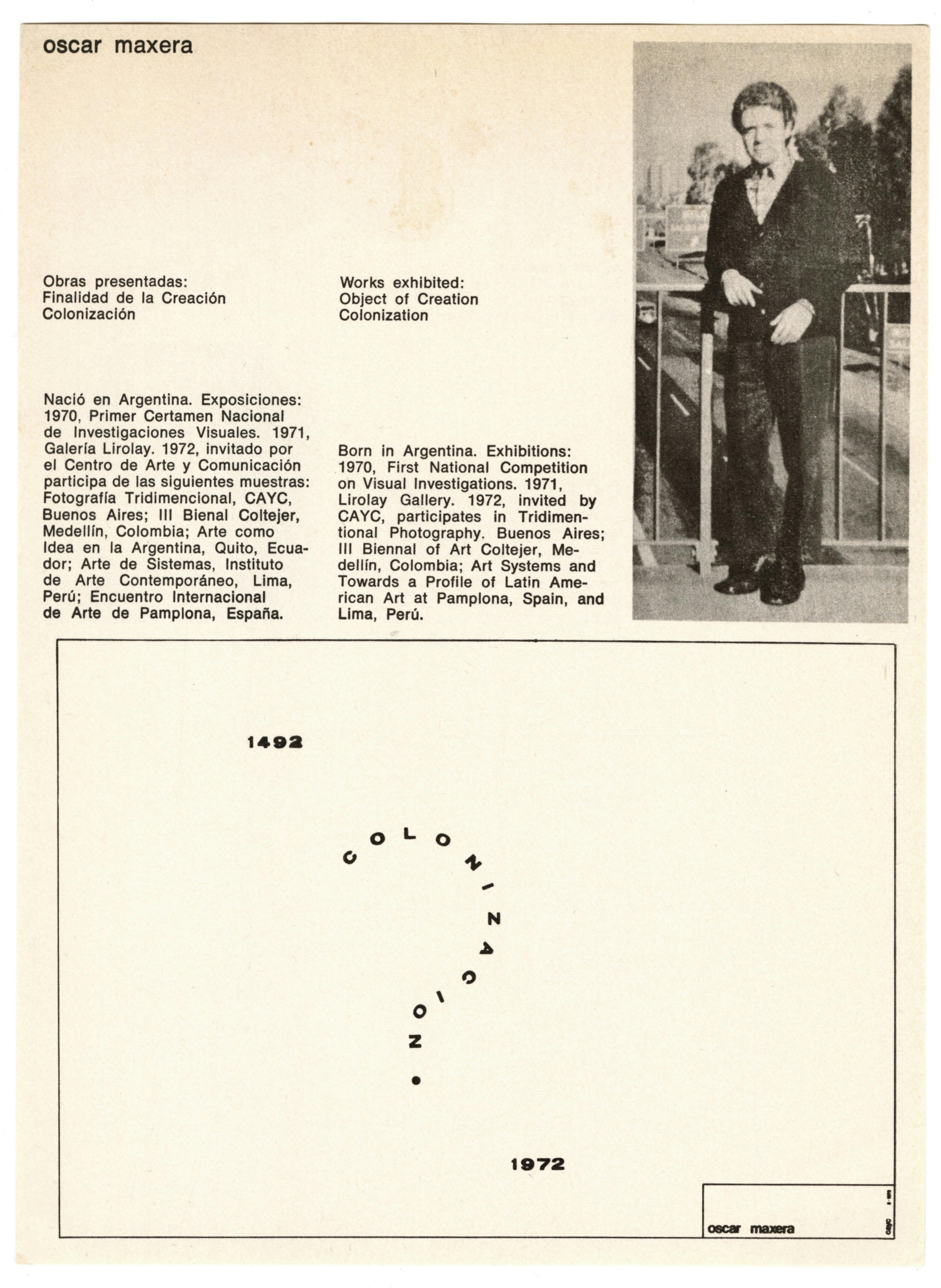
A sheet of white paper, printed with black text. On the top half of the page are printed the artist’s name, Óscar Maxera, and a list of works biography, and portrait. The list of works reads “Works exhibited: ‘Object of Creation,’ ‘Colonization.’” The biography reads: “Born in Argentina. Exhibitions: 1970, ‘First National Competition on Visual Investigations,’ 1971, Lirolay Gallery. 1972, Invited by CAYC, participates in ‘Tridimensional Photography.’ Buenos Aires: III Biennal of Art Coltejer, Medellín, Colombia; ‘Art Systems’ and ‘Towards a Profile of Latin American Art’ at Pamplona, Spain, and Lima, Perú. Appearing within a rectangular outline on the bottom half of the page are “1492,” the word “colonizacion” in the shape of a question mark, and “1972.” In a small box at the bottom right corner of the larger black rectangular outline, the artist’s name appears in small letters.

Spreads from the exhibition catalogue Hacia un perfil del arte latinoamericano, showing artwork by Auro Maxera along with an artist statement, portrait, and biographical information on the artist. © and courtesy the artist and Matías Glusberg

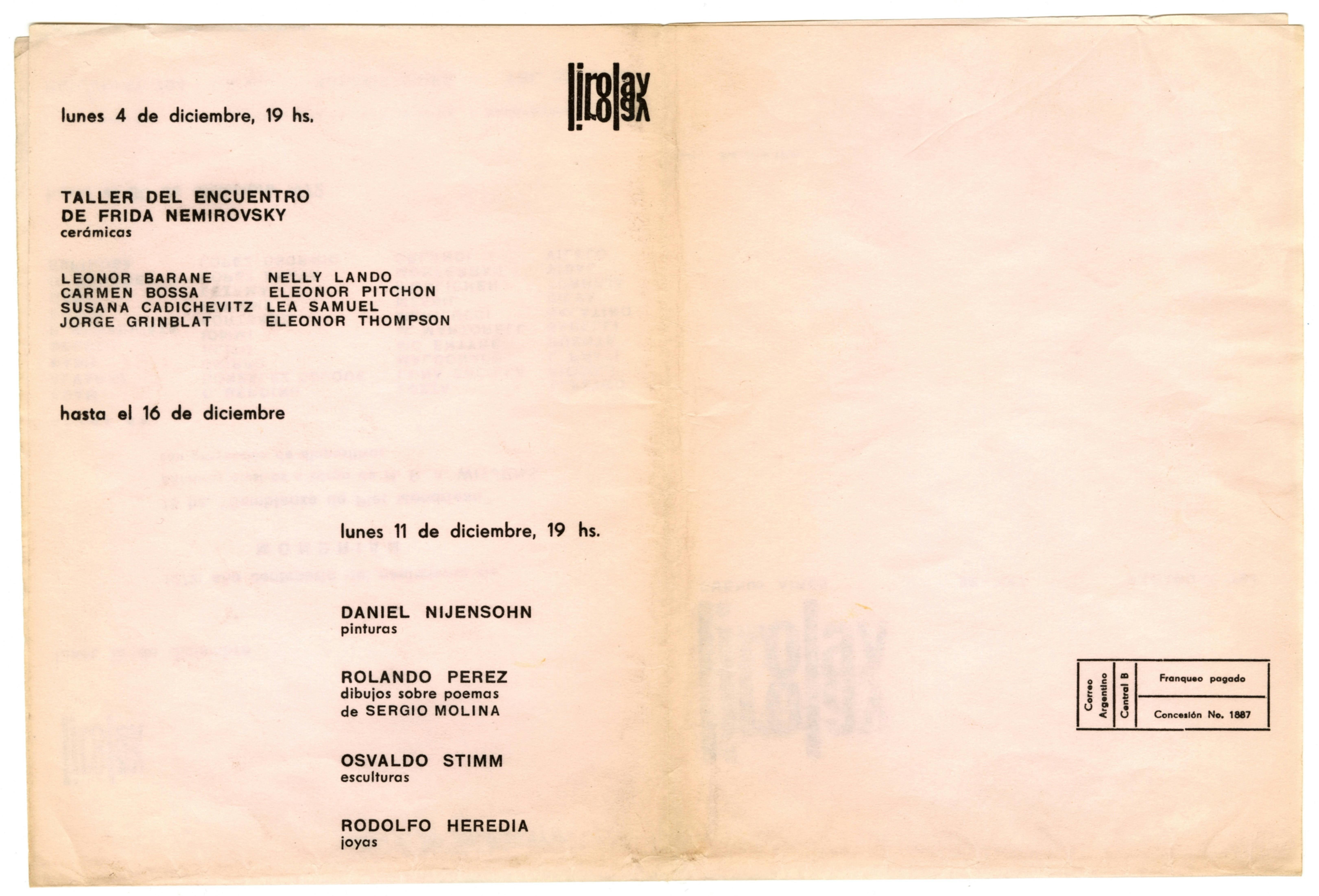
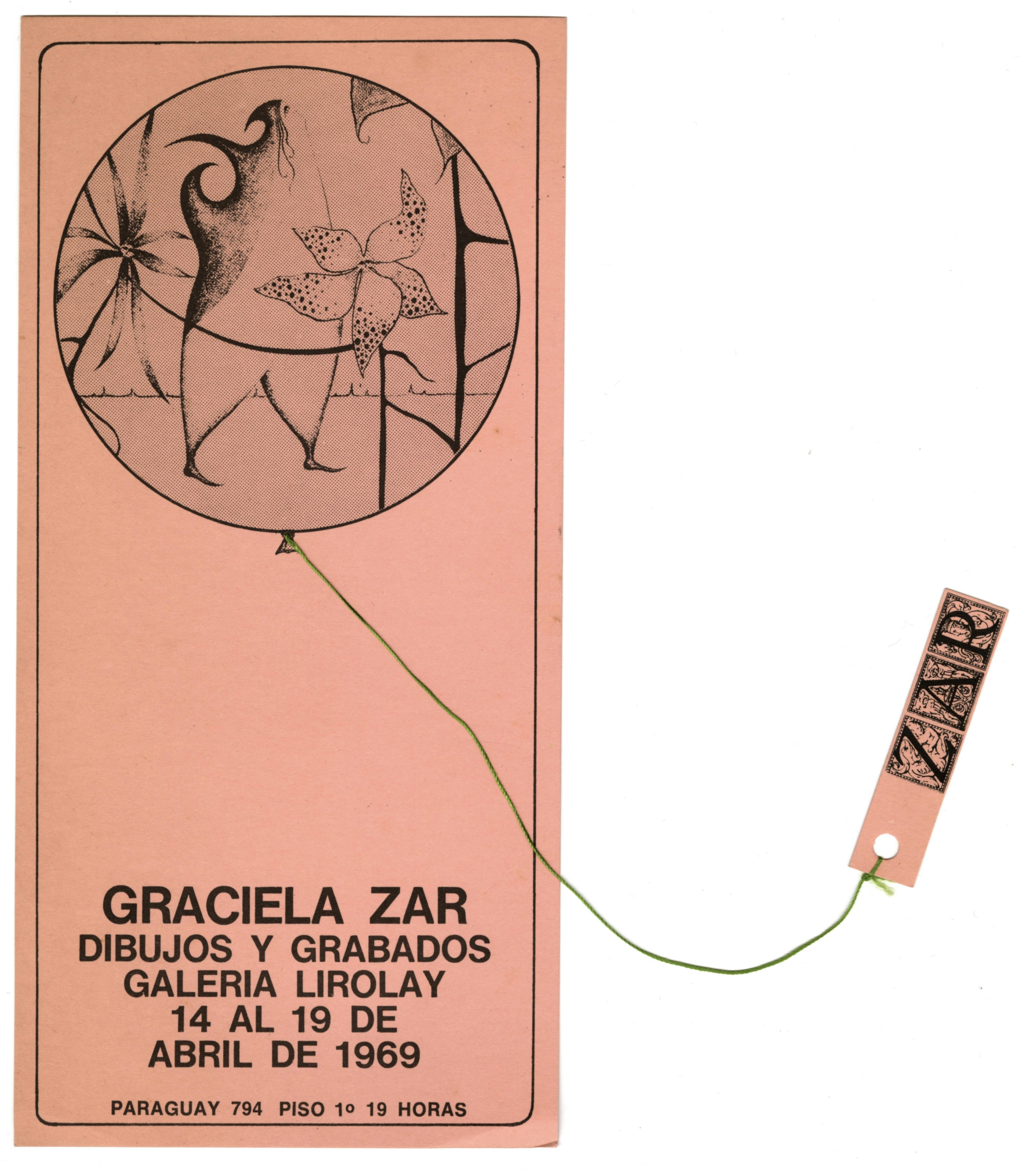
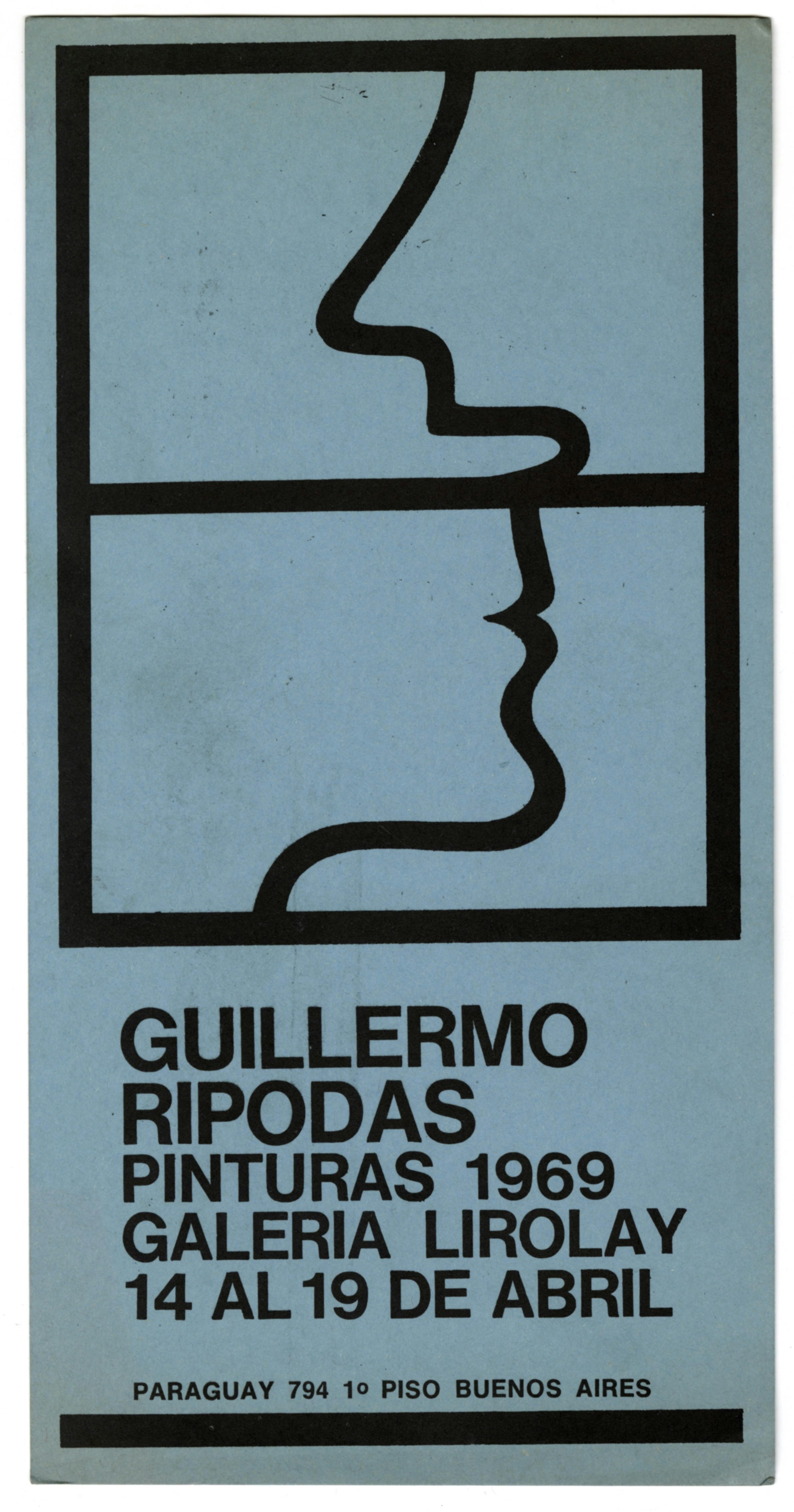
Galeria Lirolay (1960–81) is credited with giving a home to the countercultural Argentine artistic movements of the 1960s. Several of the graphic works that the gallery produced were created by the designer Edgardo Giménez,“ 18 then considered an enfant terrible, at times in collaboration with thedesigner Ricardo Blanco. These invitations to group shows and gatherings veer from templated formulae toward more expressive, colorful, and daring typography. For example, the invitation for an exhibition of textiles by the artist Nora Agrest uses the typeface Cooper Black, departing from the prevailing use of sans serif gothic typefaces in this kind of printed piece. The invitation’s design is pushed further by the inclusion of hand drawings, creating a surface on which Agrest’s local language meets more rigid modernist design gestures.

A folded sheet of paper printed with black text detailing the dates and artists included in the exhibition, reading: “Lunes 4 de diciembre, 19 hrs. hasta el 16 de diciembre,” “Taller del encuentro de Frida Nemirovsky: Cerámicas,” “Leonor Barane, Carmen Bossa, Susana Cadichevitz, Jorge Grinblatt, Nelly Lando, Eleonor Pitchon, Lea Samuel, Eleonor Thompson.” Below, in a different column, in the same black type, there is text that reads “Lunes 11 de diciembre, 19 hrs. Daniel Nijesohn: pinturas: Rolando Pérez: dibujos sobre poemas de Sergio Molina. Osvaldo Stimm: esculturas. Rodolfo Heredia: joyas.” Left of center at the top of the sheet of paper is the gallery’s logo—“Lirolay” in lower case letters, doubled such that a reflection of the gallery name appears mirrored on the vertical axis.

Press release for the exhibition Taller del encuentro de Frida Nemirovsky at Galería Lirolay, Buenos Aires, December 4–16, 1972

A vertical pink postcard printed with black images and text. In the upper half of the card there is a circular outline of a balloon, containing anthropomorphic floral drawings. A green thread emerges from the bottom center of the balloon, the other end of which is tethered via a hole-punch to a small rectangular piece of paper with the artist’s name printed in serif letters. These letters are set in tile-like frames with minute illustrations of figures. At the bottom of the postcard is printed the exhibition’s title, dates, and address.

Invitation for Graciela Zar: Dibujos y Grabados at Galería Lirolay, Buenos Aires, April 14–19, 1969. © the artist

A vertical blue postcard printed with black images and text. In the upper two thirds of the postcard, a vertical rectangle is bisected horizontally by a line. Above the bisecting line, a single curved line suggests a profile with nose and open mouth facing left. Below the bisecting line, a different curved line suggests a profile with pursed lips and chin facing right. At the bottom of the postcard is printed the exhibition’s title, dates, and address.

Invitation for the exhibition Guillermo Ripodas: Pinturas 1969 at Galería Lirolay, Buenos Aires, April 14–19, 1969. © the artist

A vertical blue piece of paper printed with white text and images. In the bottom two thirds of the paper, three horizontal rectangles contain figural drawings. In the uppermost rectangle, a lone figure is positioned at center and appears to be crying. In the middle rectangle, the same figure stands at the left of the composition and is revealed to have six leaflike arms. The figure appears to be in dialogue with a bird-like character, positioned at right. In the negative space around them are drawn droplets that suggest rain. In the bottommost rectangle, the plantlike figure is again at center, positioned between four low arcs. The composition is framed at left and right by the outlines of trees. Four trees also appear to grow horizontally from the figure’s neck. At the top of the paper, above the three rectangles, is printed the exhibition’s title, dates, and address.

Invitation for the exhibition Nora Agrest: Tapices at Galería Lirolay, Buenos Aires, April 9–21, year unknown. © the artist

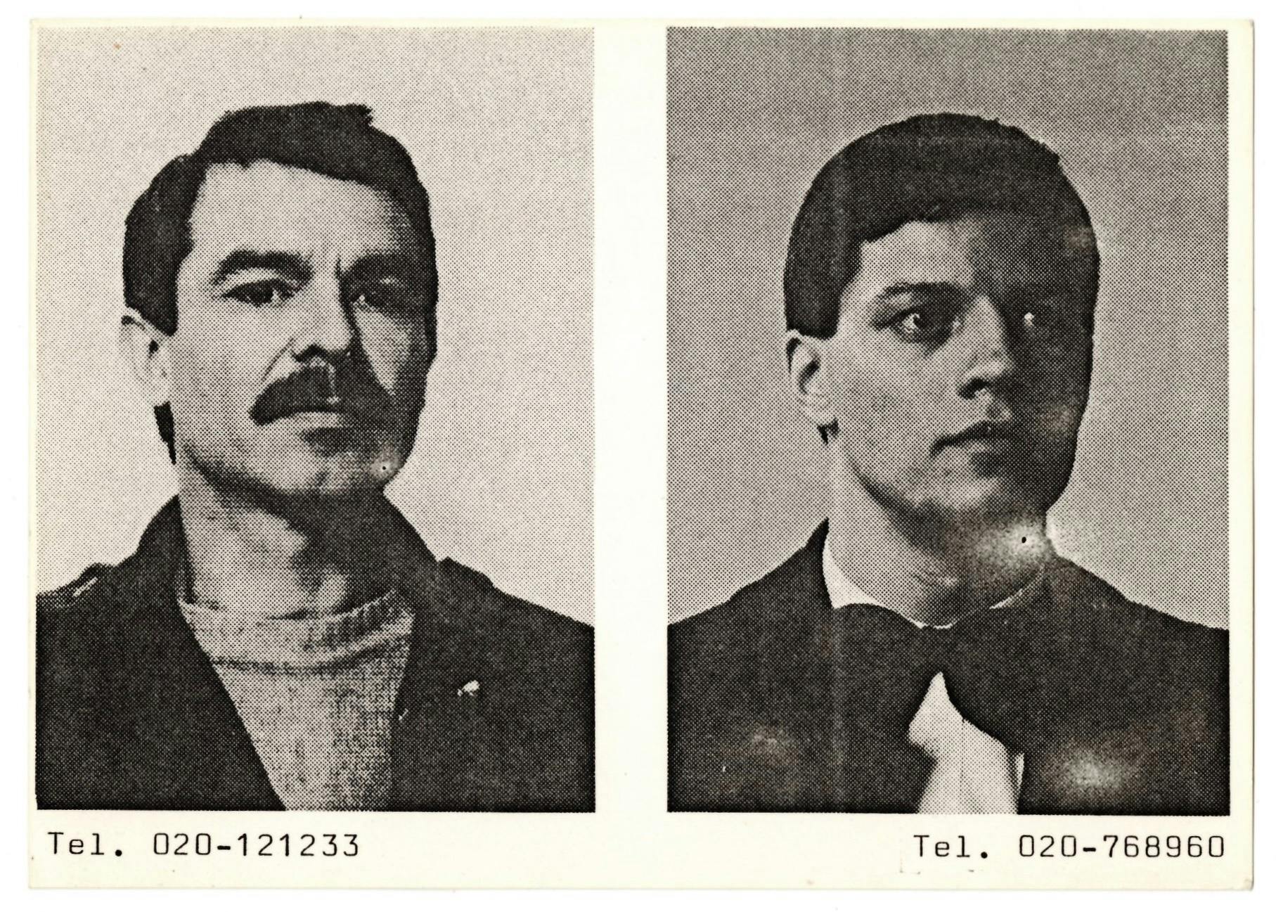
Ulises Carrión is often considered one of the key figures of Mexican Conceptual art. He was born in San Andrés Tuxtla, Mexico, in 1972, and, after finishing his studies, he moved his practice to Amsterdam, where he opened the highly influential Other Books and So, a distribution center for artists’ publications and multiples. He is one of the key figures and proponents of Mail art. Carrión’s highly fluid production style (which spans typography, handwriting, typewriting, stamps, and ephemera) removes itself from the neatly organized and minimalist conceptual works of many art and design “heroes.” It is idiosyncratic, maximalist, exuberant, and humane in its ways of engaging, talking, and opening to fluidity.

A horizontal white postcard printed in black and white with two side-by-side portraits and text. In the left portrait, a middle-aged man with a moustache who is wearing a sweater and overcoat is seen in three quarter view and appears to look directly at the camera. In the right portrait, a young man wearing a bowtie and jacket is seen in three quarter view and appears to look to the left of the camera. Beneath each portrait and justified to the left and right edges respectively are printed two phone numbers: “Tel. 020-121233” and “Tel. 020-768960.”

Ulises Carrión, Multiple Choice, 1981. Offset print on card stock, 4 3/16 × 6 1/16 in. (10.6 × 15.4 cm). Photos of Carrión by H. Hoffmann and Marike Stooker. © and courtesy the Estate of Ulises Carrión

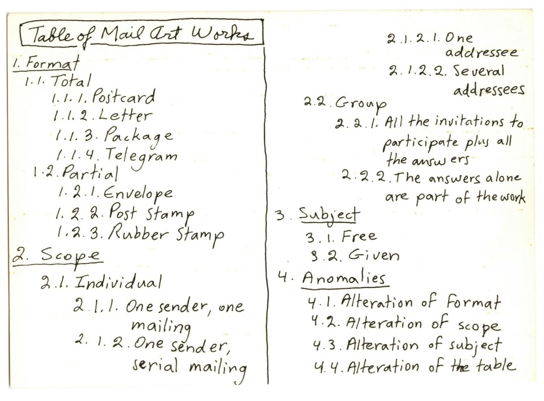
A horizontal white postcard printed in black and white. Below the title “Table of Mail Art Works,”, hand-drawn lettering outlines different categories of Mail art in two side-by-side columns. The text reads: “1. Format—1.1. Total: 1.1.1 Postcard; 1.1.2. Letter; 1.1.3. Package; 1.1.4. Telegram.1.2: Partial: 1.2.1. Envelope; 1.2.2. Post stamp; 1.2.3. Rubber stamp. 2. Scope—2.1. Individual: 2.1.2. One sender, one mailing; 2.1.2. One sender, one mailing; 2.1.2. One sender, serial mailing; 2.1.2.1. One addressee; 2.1.2.2. Several addressees. 2.2. Group: 2.2.1. All the invitations to participate plus all the answers; 2.2.2. The answers alone are part of the work. 2. Subject—3.1. Subject: 3.1. Free; 3.2. Given. 4. Anomalies—4.1. Alteration of format; 4.2. Alteration of scope; 4.3. Alteration of subject; 4.4. Alteration of the table.”

Ulises Carrión, Table of Mail Art Works, ca. 1980. Offset print on card stock, 4 3/16 × 5 13/16 in. (10.6 × 14.7 cm). Other Books and So Archive, Amsterdam. © and courtesy the Estate of Ulises Carrión

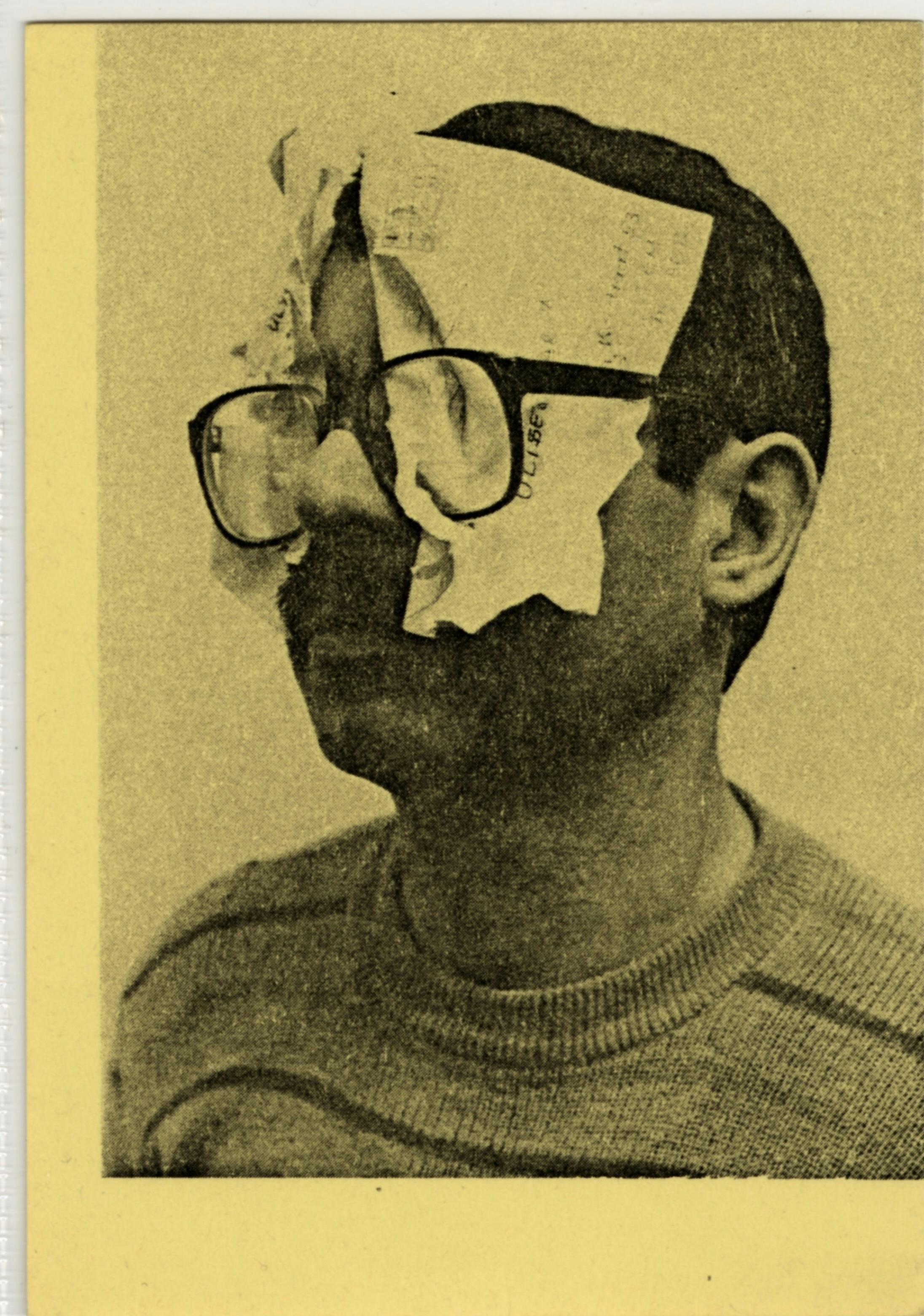
A horizontal yellow postcard printed with a black image of a man in three quarter view. He is wearing glasses. Crumpled pieces of paper have been stuffed behind each lens.

Ulises Carrión, Seeing Mail, 1981. Offset print on card stock, 5 1/8 × 3 5/8 in. (13 × 9.2 cm). Photo of Carrión by J. Liggins. © and courtesy the Estate of Ulises Carrión

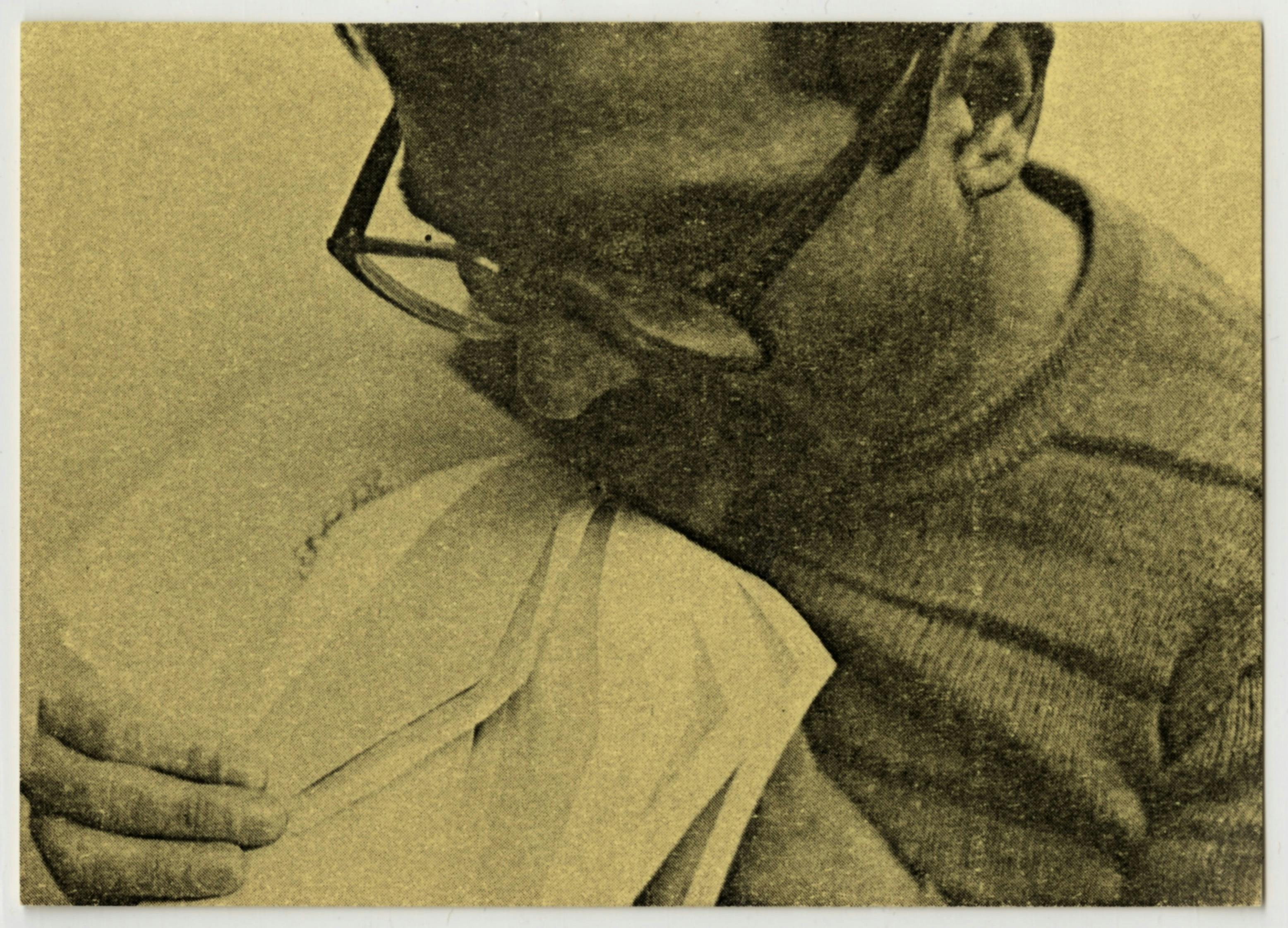
A horizontal yellow postcard printed with a black image of a man holding many open envelopes and licking the glue seal of one of them.

Ulises Carrión, Tasting Mail, 1981. Offset print on card stock, 3 5/8 × 5 in. (9.2 × 12.7 cm). Photo of Carrión by J. Liggins. © and courtesy the Estate of Ulises Carrión

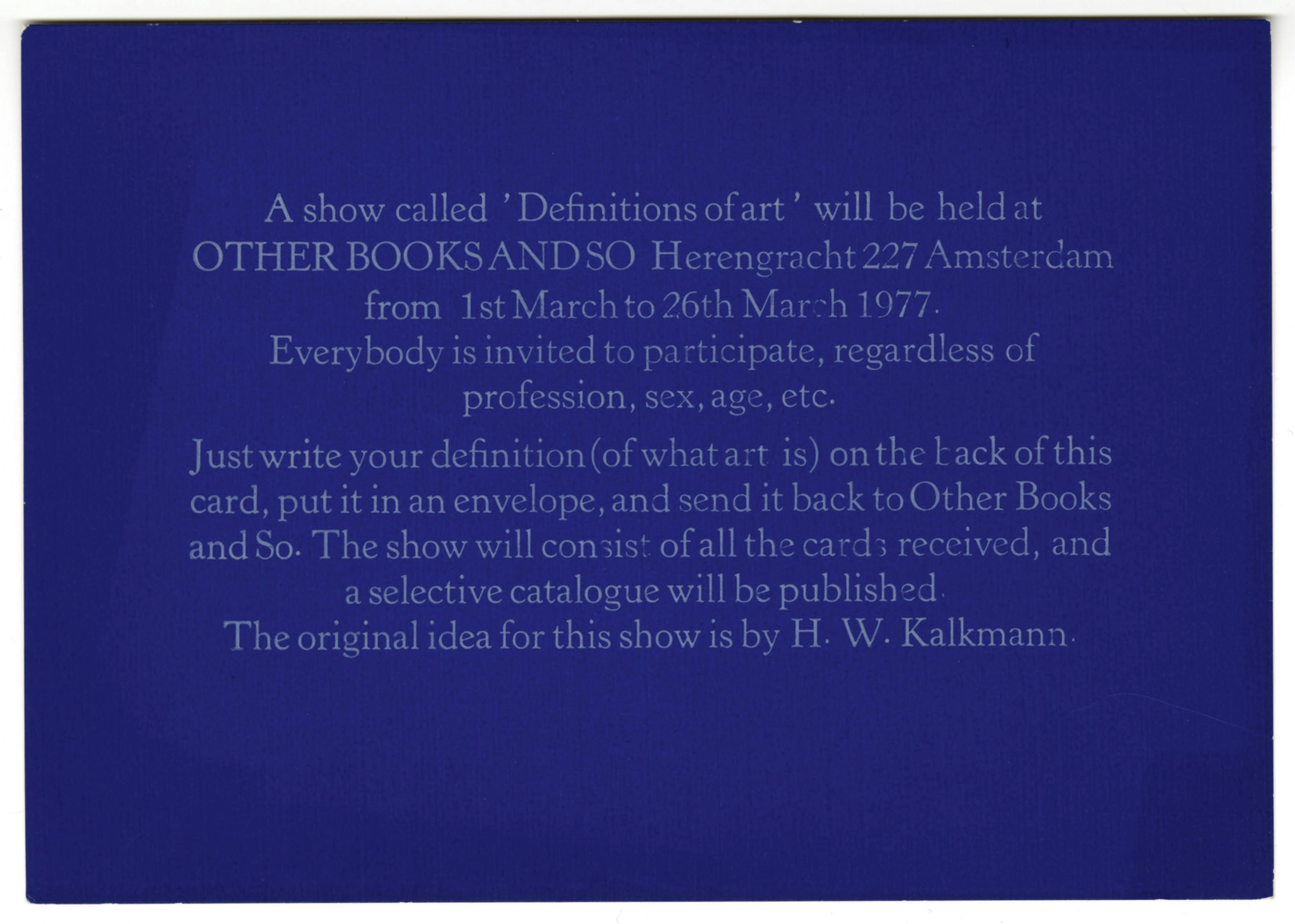
A horizontal blue postcard printed with white text, which reads, “A show called ‘Definitions of art’ will be held at OTHER BOOKS AND SO Herengracht 227 Amsterdam from 1st March to 26th March 1977. Everybody is invited to participate, regardless of profession, sex, age, etc. Just write your definition (of what art is) on the back of this card, put it in an envelope, and send it back to Other Books and So. The show will consist of all the cards received, and a selective catalogue will be published. The original idea for this show is by H. W. Kalkmann.”

Ulises Carrión, Definitions of Art, 1977. Offset print on card stock, 4 1/8 × 5 15/16 in. (10.5 × 150 cm). The words “ART IS:,” are stamped on the verso. © and courtesy the Estate of Ulises Carrión

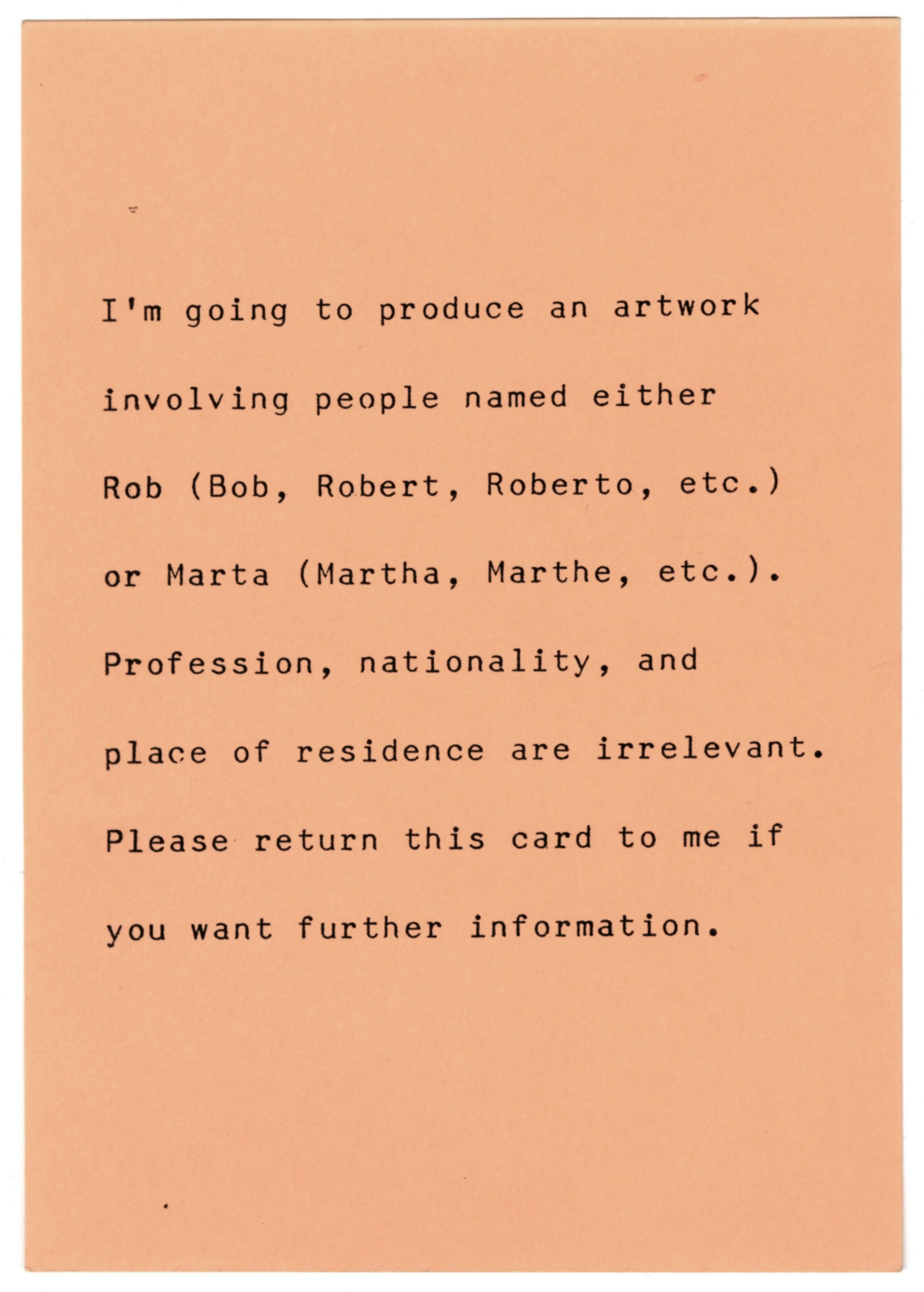
A vertical pink postcard printed with black text, which reads, “I’m going to produce an artwork involving people named either Rob (Bob, Robert, Roberto, etc.) or Marta (Martha, Marthe, etc.). Profession, nationality, and place of residence are irrelevant. Please return this card to me if you want further information.”

Ulises Carrión, Rob and Marta, 1983. Offset print on card stock, 5 7/8 × 4 3/16 in. (14.9 × 10.6 cm). © and courtesy the Estate of Ulises Carrión

It has not been possible to locate the copyright holders of the ephemera from Artemúltiple and Galería Lirolay, despite having carried out a diligent search. ISLAA makes itself available to rights holders to agree on the content of the legal notice.
1. Digging is used here as a nod to Gloria Anzaldúa and James Baldwin, who speak in their works and writings about the idea of excavating one’s lineage. 
2. Archives are complicated spaces with limited scope, a selection that is determined by many factors. They are also full of possibilities, discoveries, and joy.
3. Artes gráficas means graphic arts in Spanish. For the purposes of this text, I am using this term to indicate more inclusive, community-based artistic practices.
4. Here, I am referencing the work of Arturo Escobar and the many Latin American scholars who have helped shape the field of decolonial studies and challenged design to shift toward more open, communal, and respectful practices. 
5. The term “graphic design” is credited to the US designer W.A. Dwiggins, who used the phrase to describe his work as an illustrator, advertising artist, calligrapher, typographer, type designer, and book designer in an interview with the Boston Evening Transcript in 1922. 
6. Felipe Taborda and Julius Wiedemann, eds. Latin American Graphic Design (Hong Kong: Taschen, 2008).
7. This is a reference to Oswald de Andrade, “Manifesto Antropófago.” Oswald de Andrade, “Manifesto Antropófago,” Revista de Antropofagia 1 (May 1928): 3, 7. The digitized text can be found via the Center for Programs in Contemporary Writing of the Uniiversity of Pennsylvania, https://writing.upenn.edu/library/Andrade_Cannibalistic_Manifesto.pdf. A Spanish translation of the text is also available on the Education section of the official website for the City of Buenos Aires, https://buenosaires.gob.ar/areas/educacion/cepa/manifiesto_antropofago.pdf.
8. Arturo Escobar, “Autonomous Design and the Emergent Transnational Critical Design Studies Field,” Strategic Design Research Journal 11, no. 2 (May–August 2018): 139–46, quoted in Design Struggles, eds. Claudia Mareis and Nina Paim (Amsterdam: Valiz, 2021), 37.
9. Marc Becker, “Indigenous Languages in Latin America,” Yachana.
10. Although graphic design history gives much credit to Gutenberg, block printing or movable type was invented in China centuries earlier by the artist Bi Sheng (990–1051) and was subsequently revolutionized and developed by artists in Japan and Korea before arriving in Europe.
11. Gerald A. Padilla, “First Printing Press in the Americas was Established in Mexico,” Latino Book Review, February 19, 2017.
12. The Art Institute of Chicago holds a significant collection of work by Taller de Gráfica Popular and has produced important resources on the workshop’s history. “Taller de Gráfica Popular,” Art Institute of Chicago
13. Helvetica is also ubiquitous within corporate branding.
14. Here, I found the work of Cecilia Vicuña and the writing of César Paternosto (in particular his 1996 book The Stone and the Thread: Andean Roots of Abstract Art) incredibly prescient and potent.
15. Silvia Fernández, “The Origins of Design Education in Latin America: From The HfG in Ulm to Globalization,” Design Issues 22, no. 1 (Winter 2006): 3–19.
16. Powerfully democratizing printed matter, Carrión’s work is exuberant, created in community with local printers and makers (albeit in Amsterdam, not his native Mexico), and deviates with pride from the prevailing modernist and institutional approaches that were so prevalent in art and design in the 1970s and 1980s.
17. Ella Ravilious, “Centro de Arte y Comunicación (CAYC)," Victoria and Albert Museum Blog, July 8, 2016.
The Institute for Studies on Latin American Art (ISLAA) supports the study and visibility of Latin American art.
142 Franklin Street New York, NY 10013

Tue–Sat: 12–6 PM Sun–Mon: Closed

142 Franklin Street New York, NY 10013

Copyright © 2023 Institute for Studies on Latin American Art
The Institute for Studies on Latin American Art (ISLAA) supports the study and visibility of Latin American art.

Tue–Sat: 12–6 PM Sun–Mon: Closed
SUBSCRIBE